Developer portal
The developer portal for truvi’s API. Designing for people who read documentation the way nobody reads anything else.
- Role
- Product designer
- Where
- truvi
- When
- Current
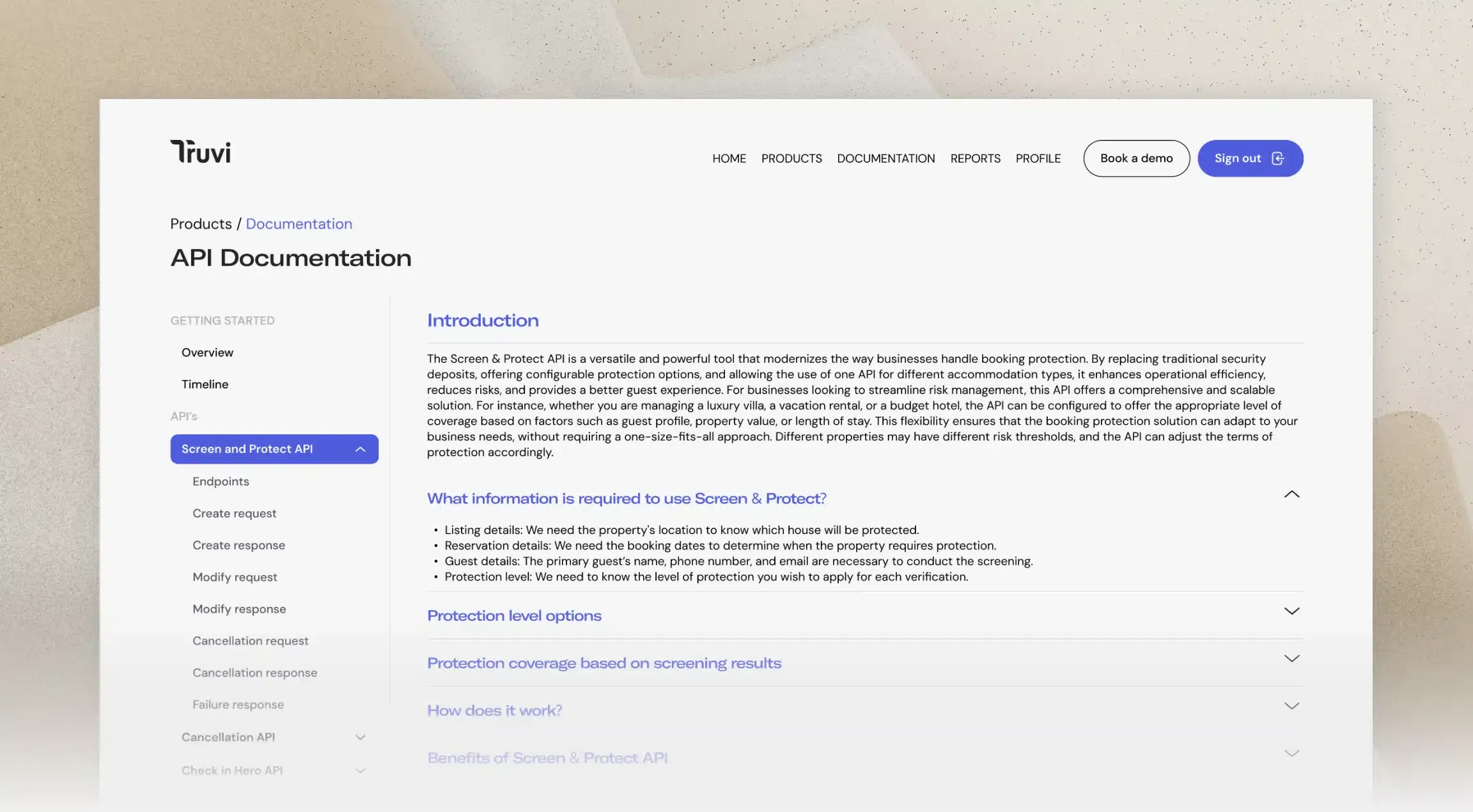
A developer portal for truvi’s API — the place an engineer lands when they have to integrate with us and would rather be doing almost anything else.
As with the dashboard, this is my current employer, so what follows is about the craft rather than the product.
Documentation is not read, it is raided
Nobody sits down with API documentation and works through it. They arrive from a search result, mid-task, with a terminal already open, looking for one specific thing. Then they leave.
That single observation decides most of the design. It means the landing page matters far less than people assume, and the individual endpoint page matters far more, because that’s where every search result actually lands. It means navigation has to work when somebody arrives three levels deep with no context. And it means a beautiful overview page that requires reading is a beautiful page nobody reads.
Designing for a hurried, slightly irritated expert is a genuinely different brief from designing for a curious newcomer, and it’s the one I kept having to remind myself of.
What I have learned designing it
Code is the interface. On most products the interface is what I draw. Here the interface is a request and a response, and my job is to present them so they can be copied, adapted and understood in that order. A code sample that cannot survive being pasted straight into a terminal has failed, regardless of how it looks on the page.
Every unanswered question becomes somebody’s afternoon. Documentation has an unusually direct feedback loop: a gap in a page becomes a support ticket, and a colleague answers the same question by hand for the fourth time. Watching that happen changed how I prioritise — I stopped ranking pages by traffic and started ranking them by what they were costing the people around me.
Search beats structure. I spent a while on the information architecture, arranging things into a hierarchy that made sense to me. Most people never see it. They search, or they arrive from Google. The taxonomy still matters, but mainly as a way to keep the writing coherent, not as a way for anybody to navigate.
What I would tell myself at the start
Read the support channel before drawing anything.
I designed the first version from the API specification, because that’s the tidy, complete, authoritative source. The specification tells you what exists. It does not tell you what confuses people, and only one of those two things is a design brief.